
01
Information architecture
Flows and hierarchy mapped before screens.
[ Platform service ]
Figma UI/UX work from information architecture and wireframes through Variables, prototypes, design systems, and developer handoff.
[ What you get ]
[ How it works ]
[ Capabilities ]
The platform and discipline surface we work across — what an engagement can cover when the scope calls for it.
Flows and hierarchy mapped before screens.
Low-fidelity reviews that kill bad ideas cheaply.
Components, variants, and Variables modeled for reuse.
Token-driven color, spacing, and type across modes.
Interactive prototypes that test flows, not just screens.
Responsive component behavior that survives real content.
Contrast, focus order, and touch targets checked at design time.
Specs, code snippets, and asset exports organized for build.
Build-versus-design review loops until pixels match intent.
[ Field notes ]
[ Common questions ]
A Figma design system combines Variables, design tokens, a component library, and pattern library so teams reuse consistent building blocks. Dev Mode and Code Connect can make the handoff to engineering more explicit.
Wireframes are produced at low, mid, and high fidelity. Each level tightens structure and visual detail before moving to the interactive prototype.
Designs follow accessibility (a11y) and WCAG 2.2 conformance, covering contrast ratios, keyboard navigation, and screen-reader support. These patterns are embedded in the design system itself.
Handoff includes organized Figma files with versioning, inspectable design tokens, and clear file organization. It is structured so engineers can translate components and styles directly into code.
Yes, responsive design is built in through adaptive grids and flexible spacing systems. Components behave correctly across breakpoints and device sizes.
[ Industry examples ]
Industry case studies in this practice area — the problem, the build, and the results, credited to the agency that delivered each one.
 Design & Branding
Granola · 2026
$1.5bnvaluation within three months of the rebrand
 Design & Branding
Huntington Bank · 2025
150+years of brand heritage
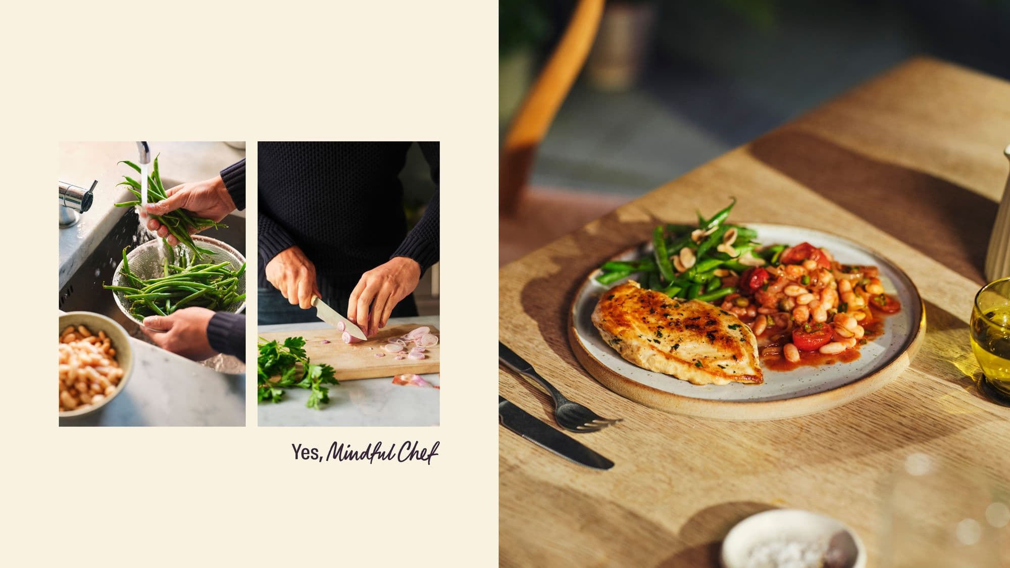 Design & Branding
Mindful Chef · 2025
4disciplines: identity, verbal, photography, digital
[ Sibling platforms ]
[ Field guides ]
A handoff-ready Figma file has named layers, token-backed styles, documented states, responsive rules, and specs that remove guesswork before the build starts.
UX defines the flow and the problem being solved; UI defines the visual and interactive layer. Scoping them separately makes design proposals easier to judge.
[ Next step ]
Back to Design & Branding