
[ Industry case study — Design & Branding ]
A meal-kit brand worthy of its produce
Mother Design refreshed Mindful Chef's identity, voice and photography under a new platform: 'Yes, Mindful Chef'.
Original project by Mother Design ↗Industry reference — not a NexSum Labs engagement.
- Client
- Mindful Chef
- Industry
- Consumer goods / food
- Services
- Brand identity, Verbal identity, Photography direction, Digital design
- Year
- 2025
- Location
- London, UK
The client
Mindful Chef is a UK meal-kit company built on the mission 'Eat well. Live better.' It delivers chef-quality, health-focused recipes for people who are health-conscious but short on time.
The challenge
The meal-kit category tends to trade care for convenience, stripping food of joy and flavour. Mindful Chef's product stood above that, but its brand did not do the quality of its ingredients justice. The refresh needed to show provenance and craft while keeping the easy, everyday promise customers rely on.
The solution
01From cooks to chefs
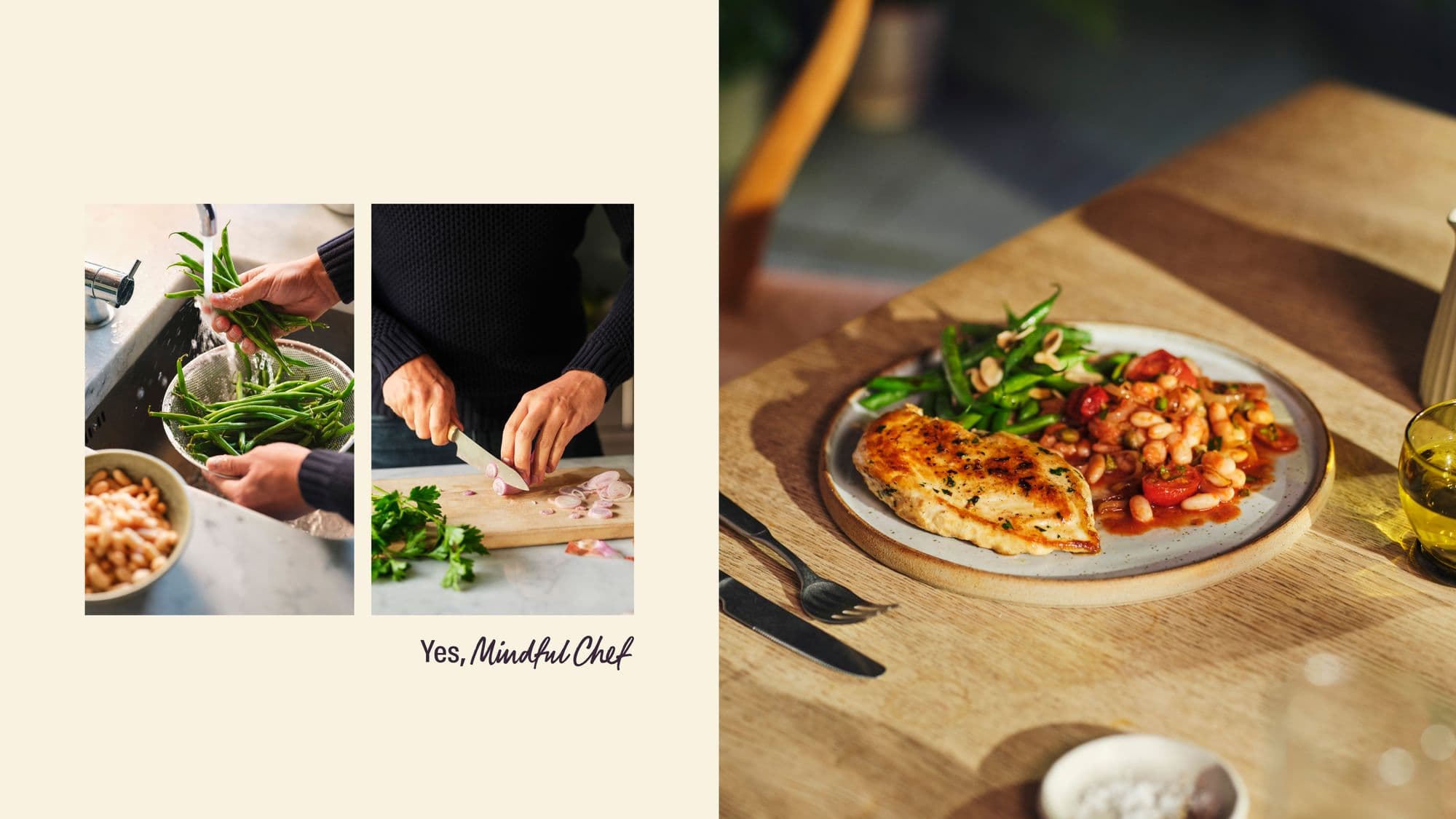
A new creative platform, 'Yes, Mindful Chef', casts the home cook as the hero. Imagery and a new tone of voice centre real kitchens and the finishing touches that make a meal special.
02Produce as the star
A rich, food-inspired palette and natural-light photography with Yuki Sugiura, Emily Kidd and Rachel Vere celebrate ingredients. Sculptural textures treat produce as artistic forms.
03Cookbook-inspired system
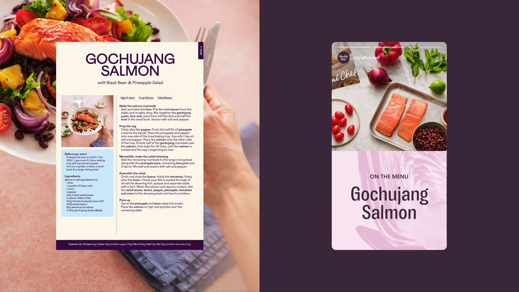
Two contrasting typefaces, Bourrasque and Ostia Antica, work like a head chef and sous chef. Layouts borrow from cookbooks, and motion nods to the box and delivery format.
The results
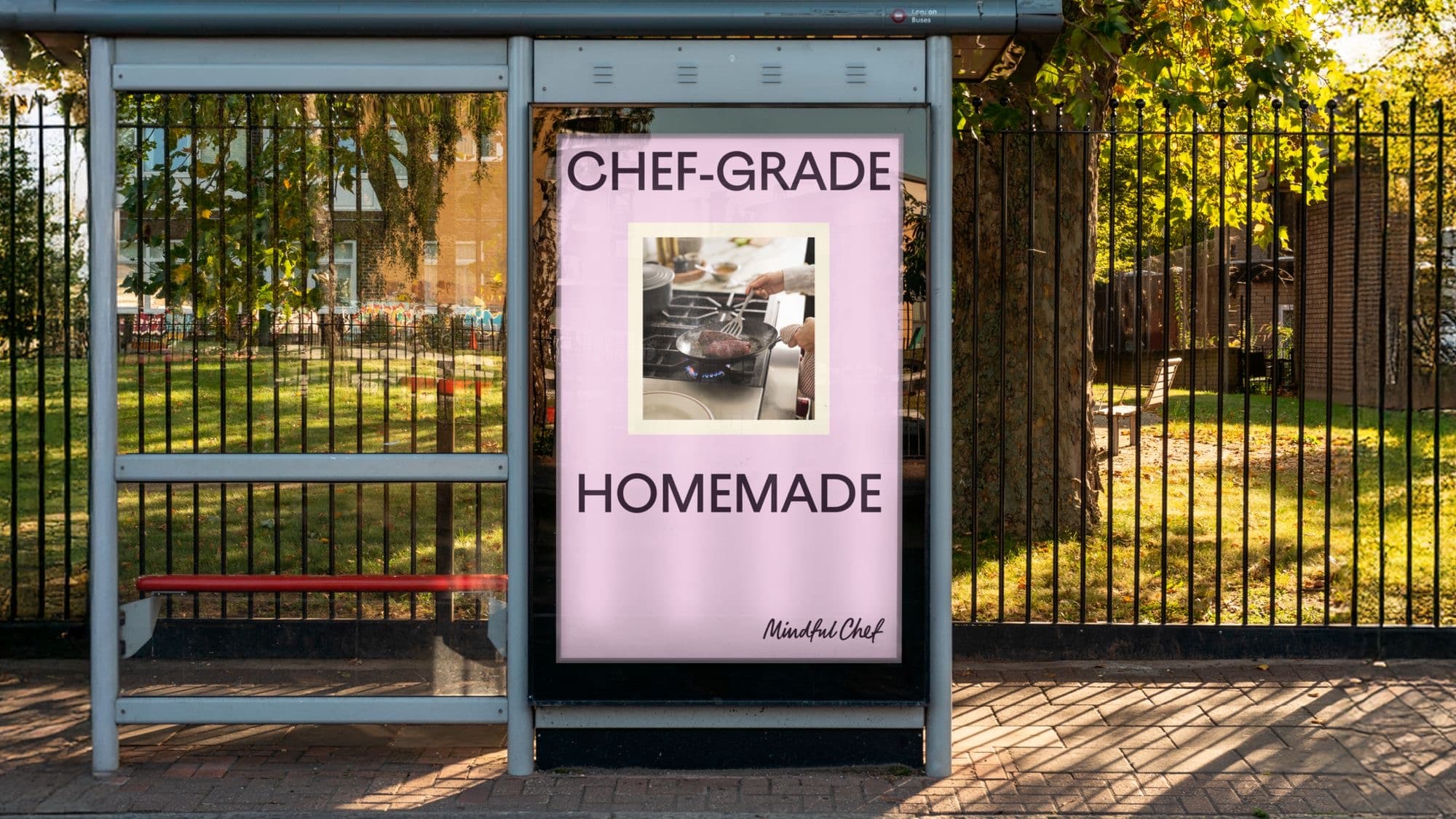
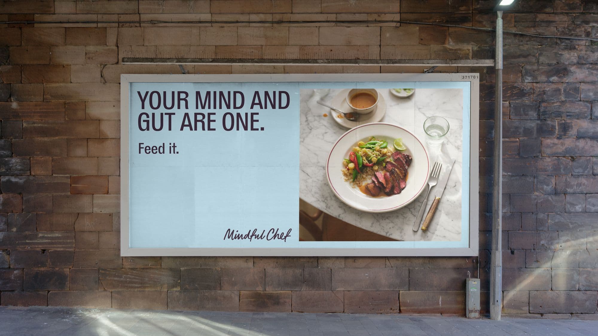
Mindful Chef now has a brand world that matches the quality of its recipes and the provenance of its produce. The identity runs across packaging, recipe cards, digital and out-of-home placements. The client's CMO describes the refresh as putting joy, warmth and chef-quality at its centre.
“The new brand world celebrates our ingredients, elevates our home cooks, and reflects the care that goes into making dinner from scratch.”
Tools & stack
Original project by Mother Design ↗ — published by the delivering agency, included here as an industry reference.
[ More industry examples ]
More from design & branding.
 Design & Branding
Granola · 2026
A human rebrand behind a $1.5bn AI notepad
$1.5bnvaluation within three months of the rebrand
 Design & Branding
Huntington Bank · 2025
Repositioning a 150-year-old bank for national growth
150+years of brand heritage
 Mobile Apps
Six Flags · 2026
Six Flags app adds 3.3M monthly users
+3.3Mmonthly users
[ Next step ]
Want this kind of result? Let's scope it.
contact@nexsumlabs.tech — we reply within one business dayNext case study — Emergency Assistance Plus